
Meeting Room Utilisation Analytics: The 2026 Data-Backed Playbook for Facility Teams
Key Takeaways
- Global average office utilisation reached 43% through 2025 and climbed to 45% by March 2026, according to the XY Sense Workplace Utilisation Index, still well below the pre-pandemic norm of 60% to 65%.
- Meeting rooms are only actively used 38% to 40% of the time on average, yet employees consistently report they cannot find one, a contradiction driven by ghost bookings and size mismatches.
- Independent sensor data from Density found that more than 25% of bookings at one Fortune 500 deployment (783 of the total tracked) were ghost meetings, and industry-wide studies from Yarooms and CoworkingCafe put the typical range at 30% to 40% of booked room-minutes going unused.
- Real-estate optimisation grounded in utilisation data can cut portfolio spend by 30% to 40% or more, per Upflex’s 2026 Office Space Utilisation Guide, freeing budget that was quietly funding empty rooms.
- Booking data alone overstates real usage because it cannot account for no-shows. Verified check-in (via a QR scan, badge tap, or sensor) is the difference between a utilisation number that reflects intent and one that reflects reality.
- Qudify’s QR-based meeting room and desk booking platform pairs a booking layer with mandatory QR check-in and automated no-show room release, turning every booking into a data point and closing the gap between “reserved” and “actually used” without installing dedicated hardware.
Walk any office floor at 10:45 on a Tuesday, and you will see the same paradox play out. The panel outside every meeting room reads “Booked.” The calendar app agrees. And yet, if you glance through the glass, half of those rooms are empty. Somewhere, a 10:00 meeting that never happened is still holding a room hostage until 11:00. Nobody released it. Nobody cancelled the invite. The room is now unavailable to the three colleagues standing in the corridor who actually need to talk.
That gap between what a calendar says and what the building is doing is not a minor annoyance. It is one of the most expensive silent line items in corporate real estate, and it has become measurable in ways it was not five years ago. Meeting room utilisation analytics, the systematic tracking of how, when, and how productively meeting spaces are actually used, has moved from a nice-to-have facilities report into a core operational discipline for any organisation serious about its space budget.
This guide unpacks what utilisation analytics really means in 2026, the primary-source data behind why it matters, the technology stack that makes accurate tracking possible, and the metrics facility teams should be watching. It also covers where a QR-based platform like Qudify fits into that stack, so you can decide what belongs in your own environment.
What Is Meeting Room Utilisation, Really? Occupancy vs Utilisation
Occupancy and utilisation get used interchangeably in workplace conversations, and they should not. The distinction is the whole reason utilisation analytics exists as a discipline.
Occupancy answers a binary question at a moment in time: is there someone in this room right now, yes or no? A boardroom with one person in it is “occupied.”
Utilisation answers a proportional question over a defined window: how much of the available time was this space actually used, and how well was it used relative to its designed capacity?
The gap between the two changes what you conclude from the data. A boardroom built for 20 that hosts one person for two hours of an eight-hour day is technically occupied, but its real utilisation is closer to a rounding error. As HubStar’s 2026 analysis of workplace metrics puts it, space utilisation “measures how effectively people are using that space, from floors in a building down to zones, neighbourhoods and even conference rooms.” Getting this distinction right is the entire foundation of meaningful analytics, and it is why calendar-only booking data is structurally insufficient: it counts intent, not reality.
Why the Meeting Room Problem Got Bigger, Not Smaller
You would think hybrid work, by putting fewer people in the office, would have quietly solved this. It did not. As organisations shrank footprints and consolidated meeting spaces, demand for the remaining rooms concentrated into fewer hours and made the mismatches more visible.
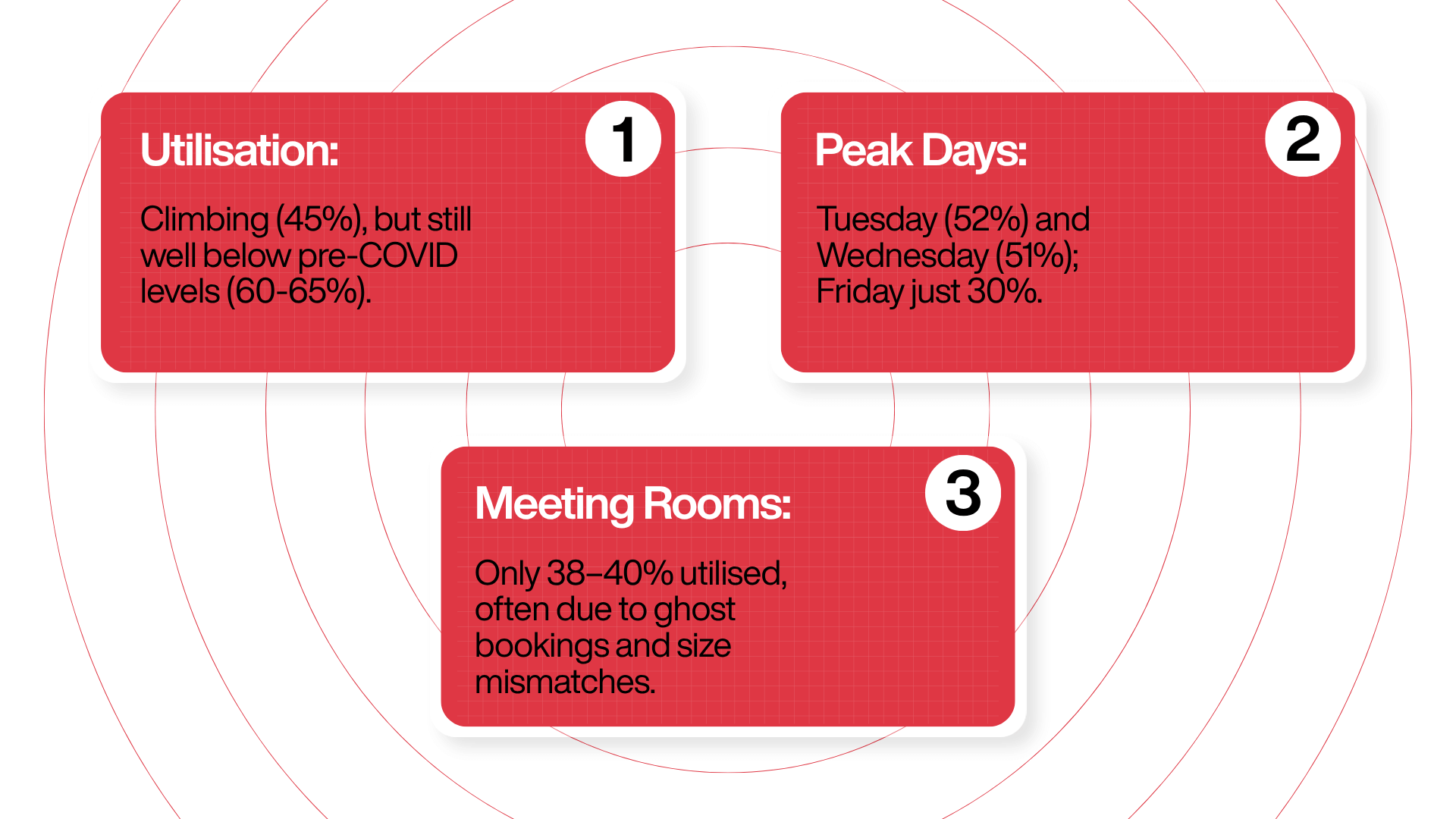
Average utilisation has climbed, but nowhere near pre-pandemic levels: XY Sense’s Workplace Utilisation Index, which aggregates over 200 billion data points from more than 63,000 workspaces globally, put average global workplace utilisation at 43% through 2025 and 45% by March 2026, up sharply from 27% in 2023 but still well below the pre-pandemic 60% to 65% band.
Demand is heavily concentrated midweek: The same XY Sense data shows Tuesday utilisation hitting 52% globally and Wednesday 51% in Q1 2026, while Friday holds structurally low at 30%. That 22-point gap has stayed stable across multiple consecutive editions of the report.
Meeting rooms specifically are running at 38% to 40% usage: Gable’s 2026 office occupancy analysis reports meeting rooms are “used only 38-40% of the time on average, yet employees consistently report difficulty finding available spaces,” a disconnect the analysis attributes primarily to ghost bookings and size mismatches.
Layer those three patterns together, and you get the modern meeting room reality: not enough overall demand to justify current footprints, but enough demand concentrated in a handful of hours that people genuinely cannot find a room when they need one. That is a management and measurement problem, not a supply problem.
The Ghost Meeting Problem, Explained
If one term captures the core inefficiency in meeting room management, it is the ghost meeting: a booking where the room shows as reserved on the calendar, but no one actually attends. The space stays empty despite appearing fully utilised on paper.
This is not a rare edge case. The data is remarkably consistent across independent sources:
- Density’s sensor deployment at a Fortune 500 customer across two office locations found that more than 25% of all meetings booked (783 of the total tracked) were ghost meetings, a figure Density’s Atlas platform surfaced by cross-referencing sensor occupancy against Google Calendar bookings.
- Yarooms’ industry analysis places the typical range higher: ghost bookings waste 30% to 40% of meeting room capacity in most offices, driven by back-to-back calendar habits, no accountability for unused bookings, and meetings that get cancelled without releasing the room.
- Worklytics’ cross-office data shows the booking-to-occupancy ratio in hybrid offices dropped to 0.71 in 2025 from 0.85 two years earlier, meaning nearly 29% of booked rooms go unused, with the ratio worsening as hybrid schedules made last-minute changes more common.
- Gartner has reported that more than 20% of meeting rooms are booked but never actually used, a floor that most other operator-side studies exceed.
The compounding effect matters more than the headline number. As Comeen’s analysis of ghost meeting rooms notes, empty-but-booked rooms create “artificial room shortages” that make people conclude they need more space when in fact they need better management of the space they have. Envoy’s guide to reducing ghost rooms makes the same point about the fix: the answer is not asking employees to be more courteous about releasing rooms, but giving facility teams real-time data and automated release so unused rooms do not stay locked for hours after a no-show.
This is the exact loop Qudify’s meeting room and desk booking system is engineered around. A booking on the calendar is not the end of the data trail; it is the start. A QR scan at the door confirms real attendance, and the Techjockey product listing for Qudify Meeting Room Booking documents a “No Show Cancellation” feature that automatically releases the room back into the pool if no one scans the QR code within the allotted time.
The Technology Stack Behind Utilisation Analytics
The Booking Layer: Where the Data Trail Begins
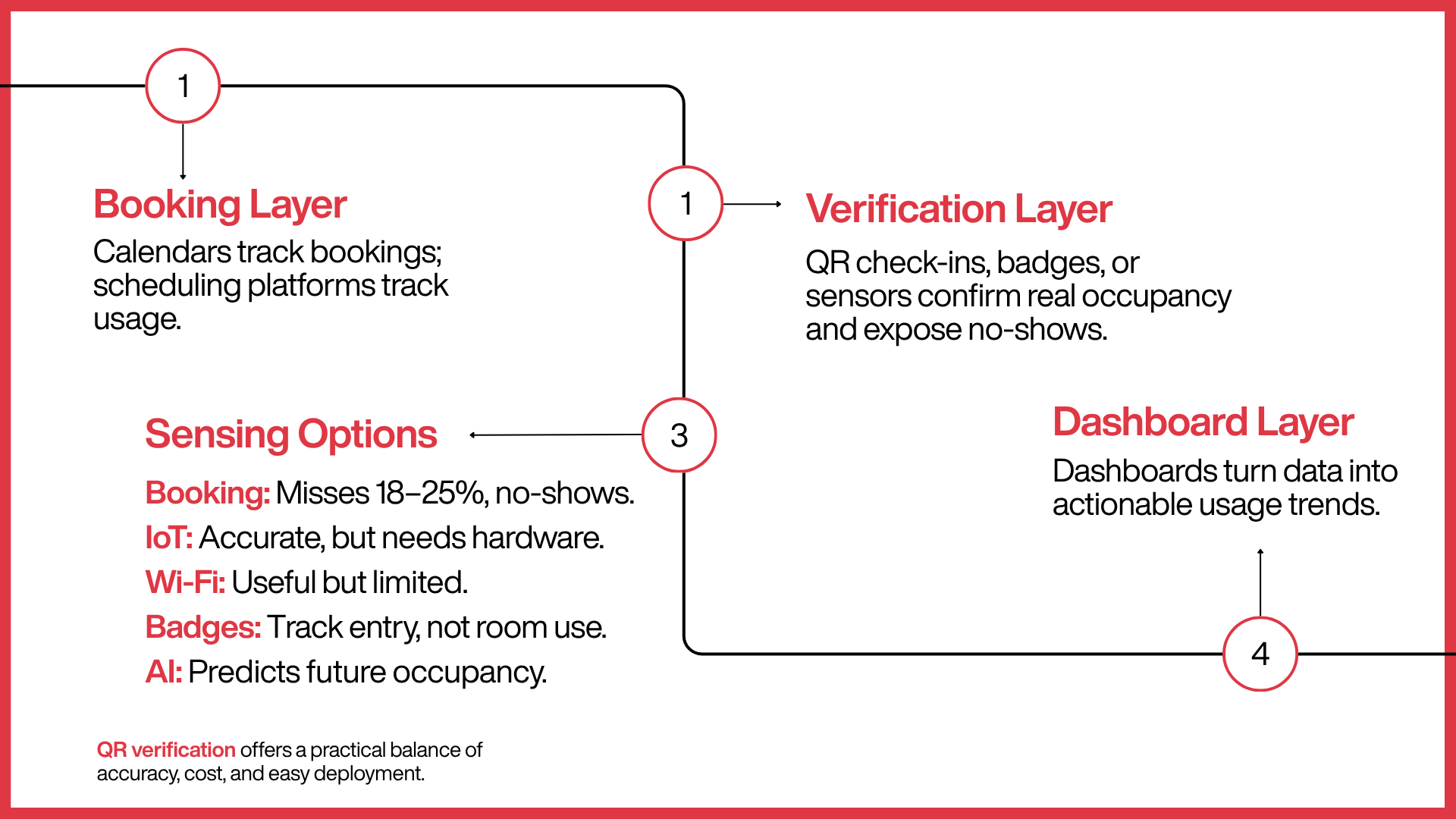
Every analytics system starts with how a booking is created. Traditional calendar-only booking, Outlook or Google Calendar with no scheduling engine in front, captures intent but nothing about reality. It cannot tell you whether the meeting happened, started late, or ended early with the room sitting empty for the remaining time.
Modern platforms layer a scheduling engine on top of the calendar to enrich the data underneath. Qudify’s approach, detailed in its Techjockey product listing, includes a scheduling engine to browse available rooms, invite participants, and sync time slots directly with existing digital calendars. That keeps the booking experience familiar to employees while giving the analytics layer richer inputs than a raw calendar can produce.
The Verification Layer: Turning "Booked" into "Actually Used"
This is the layer that separates genuine utilisation analytics from a nicer-looking calendar export. Verification requires a signal that a human is physically present: a QR scan, a badge tap, or a motion or occupancy sensor.
Qudify’s model uses QR-code check-in at the room entrance. Scanning the code confirms real-time occupancy and updates the dashboard, without requiring dedicated hardware, tablets, or app downloads from employees. That signal is what makes every downstream metric truthful. A calendar can say a room was booked for two hours; a QR scan can prove somebody actually walked in, and its absence can prove nobody did.
Sensing Alternatives Worth Knowing About
QR verification is one option, and it is worth understanding the alternatives because the choice materially affects both cost and accuracy. Upflex’s 2026 utilisation guide and Occuspace’s occupancy sensor overview break these down clearly:
- Desk and room booking systems on their own record reservations but miss no-shows entirely, which run 18% to 25% in most offices.
- IoT occupancy sensors (passive infrared, radar, or mmWave) provide granular real-time data at desk and room level, but require hardware installation across every space and a longer deployment cycle.
- Wi-Fi and network-based presence data offers a rough proxy but cannot distinguish between space types or reliably tell a huddle room apart from a lounge chair.
- Badge swipes measure whether someone entered the building, not whether they used a specific room; JLL’s 2025 benchmark noted 74% of organisations collect utilisation data but only 7% rate it as excellent.
- AI-based attendance forecasting, once enough historical data has been collected, can predict future occupancy with up to 97% accuracy per platforms like Upflex’s UnifyAI.
QR-based verification sits in a practical middle ground: accurate confirmation of real attendance without the capital cost of ceiling-mounted sensors in every room, which is why it has become a common choice for organisations that want defensible data without a hardware rollout.
The Dashboard and Reporting Layer
Raw check-in and booking events only become useful when aggregated into trends. This is where an admin dashboard becomes the product a facilities team actually interacts with daily. Qudify’s admin dashboard, as described on Techjockey, is built as “a data-driven visual hub providing high-level insights into room usage trends, peak hours, and total meeting volume,” turning individual bookings into the pattern-level insight a facilities manager can act on rather than a list of events to scroll through.
The Metrics That Actually Matter for a Facilities Team
Not every number a dashboard can produce is equally useful. A handful of core metrics drive the decisions that save money and improve employee experience.
Room utilisation rate: The percentage of booked hours a room was genuinely occupied, not just reserved. This is the single metric that reveals the ghost meeting problem at its source. Ronspot’s 2026 benchmarks place the healthy range at 60% to 75% of booked hours versus available hours; below 50% suggests rooms could be right-sized or consolidated.
Ghost meeting or no-show rate: The share of bookings where nobody checks in. Anything above 20% is a signal that booking hygiene, not room supply, is the actual bottleneck.
Peak hour distribution: Which hours of the day carry the heaviest booking pressure, useful for identifying whether the problem is total supply or poor time-of-day distribution. The XY Sense data showing Tuesday and Wednesday at 51% to 52% while Friday sits at 30% is the pattern most enterprise portfolios need to plan around.
Room-type mismatch: Whether large boardrooms are being booked for two-person calls while small huddle rooms sit fully booked. HubStar’s Hybrid Occupancy Index 2025 to 2026 found that 80% of meetings happen in rooms designed for six people or fewer, while larger boardrooms built for 17-plus people have utilisation levels of just 12%. That is a supply-mix problem masquerading as a shortage.
Average booked duration versus actual meeting length: Captures the “defensive booking” pattern where teams reserve three hours for a 90-minute meeting to be safe.
Cost per unused hour: Translates idle room time into a financial number facilities and finance teams can act on. The Yarooms framework suggests dividing annual real estate cost by usable square footage to get a cost per square foot, multiplying by each room’s footprint, and dividing by annual available hours (roughly 2,500 hours per year for a standard office schedule). At $50 per square foot annually, a 200 sq ft meeting room costs about $4 per hour of idle time.
Qudify’s admin dashboard is explicitly structured around several of these: usage trends, peak hours, and total meeting volume are called out as the core insights the platform surfaces, per its Techjockey listing.
The Financial Case for Utilisation Analytics
The business case for investing in meeting room analytics is not theoretical. It is backed by a consistent body of published research across multiple independent sources.
The scale of waste: Upflex’s 2026 Complete Guide to Office Space Utilisation puts average enterprise office utilisation at 35% to 50% and estimates that 20% to 40% of total real estate budget typically funds underused space. The same report says data-backed optimisation can deliver 30% to 40%-plus reductions in real estate costs, with some Upflex customers documenting 40% or more.
Meeting rooms specifically underperform: Gable’s 2026 office occupancy analysis confirms the 38% to 40% utilisation figure, even as employees consistently report they cannot find an available space.
The productivity cost: Beyond real estate spend, there is a direct productivity tax. Density’s analysis, drawing on Steelcase workplace research, notes that an estimated 40% of employees waste up to 30 minutes a day looking for a place to meet, time that compounds across a workforce into a significant if invisible drain.
Sensor and AI forecasting close the gap: Upflex’s 2026 research shows AI attendance forecasting can now predict occupancy patterns with up to 97% accuracy once enough historical data has accumulated, enabling facility teams to shift from reactive reporting to proactive planning. That shift, from what happened last quarter to what is about to happen next week, is the direction the entire category is moving.
The framing that has stuck with workplace analytics leaders is that a single booked-but-empty conference room looks like no big deal, but at portfolio scale it becomes one of the highest quietly recurring costs in corporate real estate. That is why treating utilisation as a tracked, owned metric, rather than a vague impression, has become a boardroom priority rather than a facilities afterthought.
How Qudify Operationalises Utilisation Analytics for Enterprises
Most of what is described above stays theoretical until a platform actually implements it end-to-end for a real office. Qudify was purpose-built around exactly this loop, and its feature set maps directly onto the analytics stack outlined earlier.
QR-first, zero-hardware verification: Unlike sensor-based systems that need hardware in every room, Qudify uses a QR-code check-in model with no kiosks, badge printers, or app downloads. Employees scan a QR code with the smartphone they already carry. That lowers the barrier to accurate check-in data compared to sensor rollouts that can take months to deploy across a large office footprint, and it means the “verification layer” described earlier is available on day one.
Automated no-show release: The Techjockey product listing for Qudify Meeting Room Booking documents a “No Show Cancellation” feature that automatically releases a room back into the booking pool if no one scans the QR code within the allotted time. This is the mechanism that attacks the ghost meeting problem at its source, rather than relying on employees to manually cancel bookings they have forgotten about.
Multi-site, multi-floor visibility: For larger enterprises, Qudify’s Multi Site Support capability, also detailed on Techjockey, lets administrators manage rooms across different floors, buildings, or office locations from a single dashboard. That matters for organisations trying to compare utilisation across a portfolio rather than a single office.
Real-time admin dashboard: The platform surfaces usage trends, peak hours, and total meeting volume as the core dashboard insights, structured so a facilities manager sees the pattern rather than a list of events.
White-labelled, enterprise-ready deployment: Qudify’s white-labelling framework lets companies customise the interface with their own branding, per the Techjockey feature breakdown, useful for large enterprises rolling the platform out under their own internal identity.
Proven at scale: According to Qudify’s business profile on GetLatka, the broader platform, spanning visitor management, meeting room booking, and feedback handling, runs across 500-plus live sites, serves 400-plus client organisations, powers over 64,000 monthly users, and has facilitated more than 1 million QR scans to date. That is a strong indicator that the underlying analytics infrastructure has been tested well beyond a pilot deployment.
Real customer feedback: A verified user review collected on G2 describes the direct benefit in plain terms: reduced conflicts from potential meeting clashes and the ability to schedule meetings “without worrying about not being able to find an empty meeting room,” precisely the pain point every ghost meeting study identifies as the most common employee frustration.
Beyond Meeting Rooms: Qudify's Wider Workspace Analytics Suite
Meeting room utilisation rarely exists in isolation from the rest of how a workplace is managed, and Qudify’s product suite reflects that. Alongside meeting room and desk booking, the platform offers a QR-based Visitor Management System that replaces paper registers with a touchless check-in flow: visitors scan a code, the host is instantly alerted, and a digital pass is issued, all captured in the same underlying analytics layer that tracks how spaces are used across the building. The platform also includes a Digital Complaint Management tool, per its Serchen profile, rounding out a suite designed to digitise the operational layer of a modern office rather than solving meeting rooms as a standalone problem.
This matters directly for utilisation analytics. A visitor scanning in for a meeting, a desk being booked for the day, and a conference room being reserved are all, functionally, the same kind of event: a claim on shared space that either gets used or does not. Having all three flow into one analytics environment, rather than three disconnected tools, is what lets a facilities team see the full picture of how a building actually breathes over the course of a week.
Choosing a Utilisation Analytics Platform: What to Look For
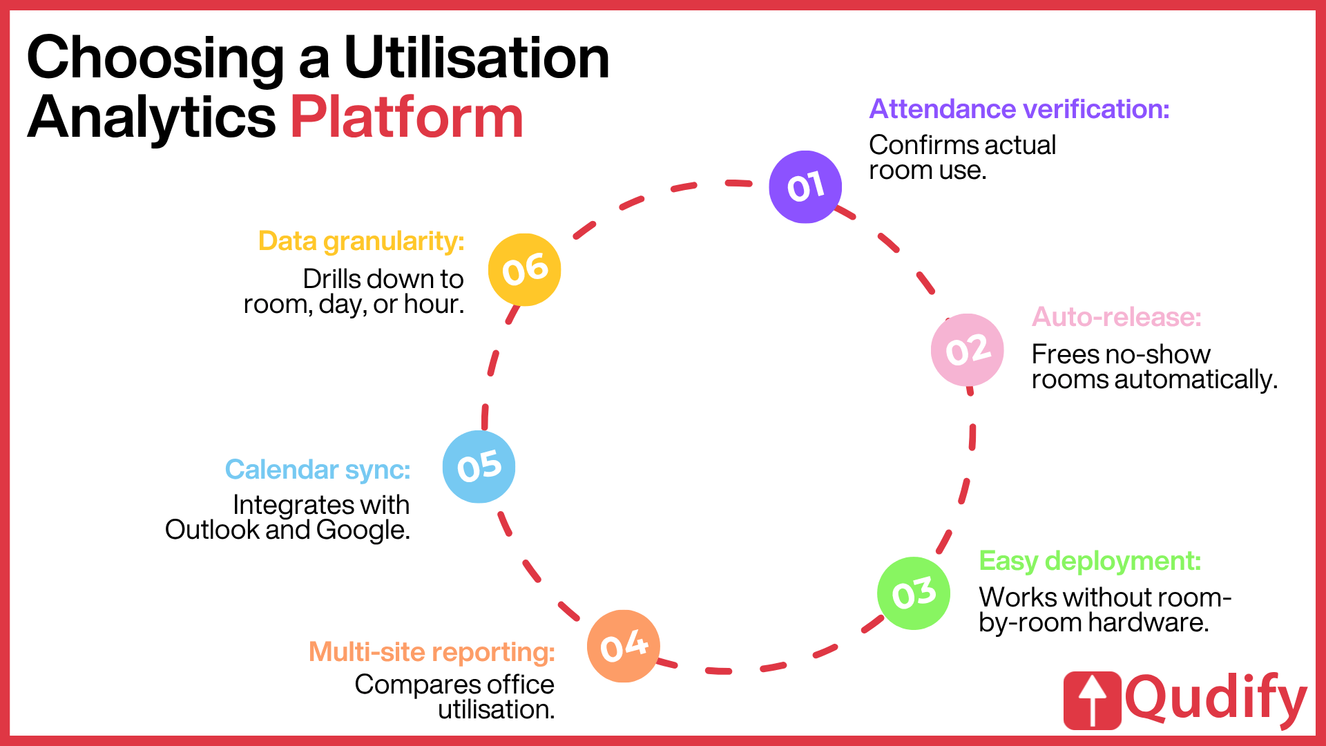
If you are evaluating a meeting room or workspace analytics platform for your organisation, a few criteria separate genuinely useful systems from a calendar export with a nicer dashboard.
Real attendance verification, not just booking data: Does the system confirm someone actually showed up, or does it simply record whether a calendar slot was reserved? Without verification, every downstream number is inflated.
Automated release mechanisms: Can the system free up a no-show room on its own within a defined grace window, or does it depend on employees remembering to cancel? The latter is the same behaviour that caused the ghost meeting problem in the first place.
Deployment friction: Does adoption require installing hardware across every room, or can it work through devices employees already carry? Long sensor rollouts stall pilots.
Multi-location reporting for any organisation with more than one office. Can the dashboard compare utilisation across sites, not just within a single floor?
Calendar integration: Does the scheduling engine sync with Outlook and Google Calendar so employees do not have to change how they book?
Data granularity: Can you drill from a portfolio-level number down to a specific room, day, or hour? Averages hide serious problems in individual spaces.
Common Mistakes Organisations Make with Utilisation Data
Even with good tools in place, a lot of facilities teams get less value from utilisation analytics than they should.
Relying on booking data alone: As Upflex’s research bluntly puts it, booking systems record reservations but do not account for no-shows, which run 20% to 30% in hybrid offices. Booking-only reporting will consistently overstate real usage.
Comparing mismatched benchmarks: Peak-hour utilisation and daily-average utilisation measure fundamentally different things. Treating them as interchangeable leads to conclusions that do not hold up.
Applying one benchmark to every space type: A floor of assigned desks, a bank of huddle rooms, and a boardroom behave completely differently and need separate, space-type-specific benchmarks rather than a single portfolio-wide number.
Treating utilisation as a one-time audit: The value of the data compounds over weeks and months. A single snapshot rarely reveals a real ghost meeting pattern, which by definition requires recurring behaviour to become meaningful. HubStar’s 2026 analysis recommends measuring utilisation across at least four consecutive weeks to filter out anomalies like holidays or company events.
Chasing 100% utilisation: A fully saturated office has no buffer for collaboration, focus work, or spontaneous interaction. It feels crowded, limits flexibility, and drives employees to prefer working from home. The goal is right utilisation, not maximum utilisation.
Conclusion
The direction of travel is fairly clear from the data already published. As AI forecasting models improve, already reaching up to 97% predictive accuracy in some enterprise deployments, the industry is shifting from reactive reporting (what happened last quarter) toward proactive planning (what is about to happen next week, and how to prepare for it). Expect tighter integration between visitor management, desk booking, and meeting room analytics into single unified workplace platforms, more automated no-show handling that removes the burden from employees entirely, and increasingly granular room-type-specific benchmarking rather than blunt building-wide averages.
Platforms built around this thesis from the ground up, combining booking, verified check-in, and analytics into one lightweight system rather than retrofitting sensors onto legacy calendar tools, are best positioned for that shift. That is the space Qudify occupies, and the direction the data reviewed throughout this guide suggests is the right one for enterprises trying to get serious about how their space is actually used.
Frequently Asked Questions
What is meeting room utilisation analytics?
Meeting room utilisation analytics is the systematic tracking and analysis of how meeting spaces are actually used, not just booked, including metrics like occupancy rate, ghost meeting frequency, peak booking hours, and room-type demand. Platforms like Qudify capture this by pairing a booking system with real-time QR-based check-in verification, so the resulting data reflects genuine usage rather than calendar intent.
What exactly is a "ghost meeting"?
A ghost meeting is a scheduled booking where a room is reserved on the calendar, but no one actually attends, leaving the space empty despite appearing fully utilised on paper. Density’s sensor deployment found more than 25% of tracked bookings fell into this category at one Fortune 500 customer, while broader industry estimates from Yarooms and CoworkingCafe put the range at 30% to 40% of booked room-minutes going unused.
How is utilisation different from occupancy?
Occupancy measures whether a space had anyone in it at a specific moment. Utilisation measures how fully or productively that space was used over a defined period. A room can register as “occupied” while still having very low utilisation if it is only in active use for a fraction of the time it was booked.
What is a healthy meeting room utilisation rate?
Ronspot’s 2026 benchmarks place the healthy range at 60% to 75% of booked hours versus available hours. Below 50% suggests rooms could be right-sized or consolidated; sustained above 80% suggests you are running with no buffer and employees are likely struggling to book space when they need it.
Does meeting room analytics actually reduce real estate costs?
Yes. Data-backed space optimisation can reduce real estate costs by 30% to 40% or more, according to Upflex’s 2026 Office Space Utilisation Guide, largely by identifying and reclaiming the 20% to 40% of real estate budget typically spent on underused space.
How does Qudify detect and prevent ghost meetings?
Qudify requires a QR code scan at the room entrance to confirm real attendance after a booking is made. If no scan happens within the allotted grace period, the system automatically releases the room back into the booking pool through its “No Show Cancellation” feature documented on Techjockey, removing the need for employees to manually cancel bookings they have forgotten about.
Does adopting utilisation analytics software require new hardware?
Not necessarily. QR-based platforms like Qudify are built on a zero-hardware model: employees scan codes with their own smartphones, avoiding the cost and rollout time associated with installing IoT sensors or check-in kiosks across every room. IoT sensor deployments still make sense for organisations that need granular occupancy density data beyond simple presence verification.
How often should we review meeting room utilisation data?
Continuously, once the platform is in place. For pattern-level decisions like right-sizing rooms or consolidating a floor, HubStar’s 2026 analysis recommends measuring across at least four consecutive weeks to filter out anomalies like holidays or company events. Facilities teams typically review dashboards weekly for operational issues and monthly or quarterly for portfolio decisions.
Can hybrid work make ghost meetings worse?
Yes. Hybrid schedules change late and often, so a room booked earlier in the week may no longer be needed once a meeting shifts fully remote, yet the reservation usually stays. Worklytics data shows the booking-to-occupancy ratio in hybrid offices dropped to 0.71 in 2025 from 0.85 two years earlier, driven largely by last-minute moves to video calls. Auto-release and mandatory check-in are what keep hybrid schedules from silently poisoning the room supply.
Do we need more meeting rooms or better meeting room management?
Almost always better management. When utilisation hovers near 40% while calendars read “full,” the constraint is wasted capacity, not a true shortage. Measuring real occupancy, enforcing check-in and auto-release, and auditing recurring meetings typically recovers more usable space than adding rooms would, at a fraction of the real estate cost.